Part 2:
Welcome back to my Layout tutorial and thank you for stopping by! If you have just joined us then please go check out Part 1: The image and then come on back to continue the tutorial. If you have already tuned in for the first lesson then please by all means keep reading. xD Because this lesson is a bit more detailed I am going to spare you a long rant and just jump on in. :)
*Disclaimer* This is how I make my layouts and is in no way how you have to do it. There are many other tutorials out there and plenty of options to do what you want. I am not forcing you to make a layout nor am I forcing you to do it my way. I am *not* endorsed by any of the sites mentioned. I love each of these and use them because they give me what I want and are very simple to use. :)
Editing Your Photo
Congratulations! You now have your layout image and are ready to start designing (AKA- the fun part).
What I will be teaching you is literally the basics, after a few layouts you imagination will run wild with all the opportunities you will have to create a very unique look.
To start things off let's head on over to Ribbet. What is Ribbet. you ask? Ribbet.com is a photo editing site that allows to do the customization of your dreams. Add filters, change eye color, create collages, do "plastic surgery", and they have over 170 fonts to choose from. The best news? It's completely free! Creating an account will allow you some benefits, like managing your uploads and a few 'premium' fonts, but yet again it's still free. I highly recommend Ribbet if you don't have Gimp or find it confusing (like I do), but don't worry, if you are a Gimp user and don't want to go to Ribbet that's fine. I will have lessons on how to make layouts on Gimp soon. But for now we will stick with Ribbet.
Okay.
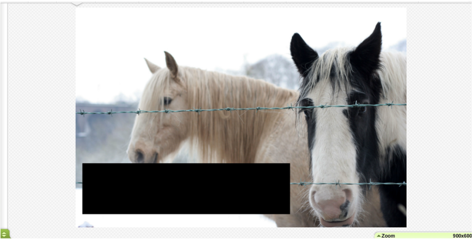
Once you are at Ribbet you are going to upload your image. Now, once your image is uploaded there are countless options for you to do. So go ahead and play around with filters and frames! Once you have the look you want you are going to go back to the "Basics Edits" page and click the "Re-size" button. You are now going to type in 900 in the left box, and hit the "Apply" button. Why 900? Well, 900px is the width of your Howrse presentation, now as you can do 800 if you want I prefer 900 because your layout will be perfectly centered and will not have any off set boarders by your page. Now that you have your image re-sized to 900 it's finally time to add your boxes!
You are now going to go to the "Stickers" tab scroll down to the "Basics" then select the "Geometric" option. Pick either a square or a rectangle, which ever works best for your image (You can even choose to do rounded edges!) and drag it to your photo. Re-size to the way you want it to fit on your layout.
What I will be teaching you is literally the basics, after a few layouts you imagination will run wild with all the opportunities you will have to create a very unique look.
To start things off let's head on over to Ribbet. What is Ribbet. you ask? Ribbet.com is a photo editing site that allows to do the customization of your dreams. Add filters, change eye color, create collages, do "plastic surgery", and they have over 170 fonts to choose from. The best news? It's completely free! Creating an account will allow you some benefits, like managing your uploads and a few 'premium' fonts, but yet again it's still free. I highly recommend Ribbet if you don't have Gimp or find it confusing (like I do), but don't worry, if you are a Gimp user and don't want to go to Ribbet that's fine. I will have lessons on how to make layouts on Gimp soon. But for now we will stick with Ribbet.
Okay.
Once you are at Ribbet you are going to upload your image. Now, once your image is uploaded there are countless options for you to do. So go ahead and play around with filters and frames! Once you have the look you want you are going to go back to the "Basics Edits" page and click the "Re-size" button. You are now going to type in 900 in the left box, and hit the "Apply" button. Why 900? Well, 900px is the width of your Howrse presentation, now as you can do 800 if you want I prefer 900 because your layout will be perfectly centered and will not have any off set boarders by your page. Now that you have your image re-sized to 900 it's finally time to add your boxes!
You are now going to go to the "Stickers" tab scroll down to the "Basics" then select the "Geometric" option. Pick either a square or a rectangle, which ever works best for your image (You can even choose to do rounded edges!) and drag it to your photo. Re-size to the way you want it to fit on your layout.
After you have your box continue with the rest unless you just want one box, then go ahead and keep it that way. ;) Once you have all your boxes positioned, sized and everything we can customize even more! Here we go.
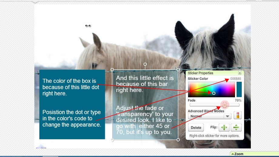
Once you have that done you can either re-size, positioned, and add or subtract a box or two if things don't look right. If not we can continue on to adding our titles.
Adding titles is really simple, go to the "Text" tab next to the "Stickers" tab, type in your text and select your font! Easy as pie. Adjust the color, fade, size, and customize to your heart's content. There is so much you can do with your titles, Layering, putting them in the box or setting them on top, keep the text small and delicate or big and bold. The possibilities are endless.
In another class I will discuss some of the unique and simple ways to style your text. But for now we will make do with what we know.
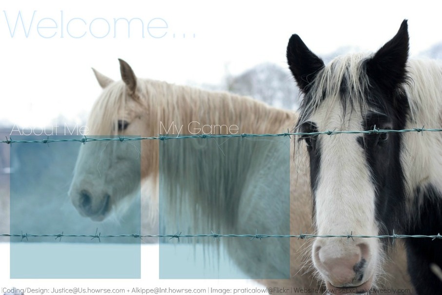
If you decided to add your username to the layout or maybe even a quote, then do that now. Have fun!
Last but not least with the text. *Make sure to add CREDIT!* If your image is from DeviantArt or Flickr and the artist has allowed you to use their image it's a must to credit them! This keeps you from getting into trouble, and allows other people to see who your photo came from. (I will talk more about Crediting in length in another class), just adding their DeviantArt or Flickr username@DA (or @Flickr depending on which site you got the photo from) at the bottom of your page where it is not too distracting but easy to see is perfectly fine for now. If you want you can also include your Howrse username next to the DA/Flikr name with "Designed+Coded by". This helps players not only see who took the photo, but also who created the layout. It's a win win for both you and the photo's owner who let's you use their image. :)
Adding titles is really simple, go to the "Text" tab next to the "Stickers" tab, type in your text and select your font! Easy as pie. Adjust the color, fade, size, and customize to your heart's content. There is so much you can do with your titles, Layering, putting them in the box or setting them on top, keep the text small and delicate or big and bold. The possibilities are endless.
In another class I will discuss some of the unique and simple ways to style your text. But for now we will make do with what we know.
If you decided to add your username to the layout or maybe even a quote, then do that now. Have fun!
Last but not least with the text. *Make sure to add CREDIT!* If your image is from DeviantArt or Flickr and the artist has allowed you to use their image it's a must to credit them! This keeps you from getting into trouble, and allows other people to see who your photo came from. (I will talk more about Crediting in length in another class), just adding their DeviantArt or Flickr username@DA (or @Flickr depending on which site you got the photo from) at the bottom of your page where it is not too distracting but easy to see is perfectly fine for now. If you want you can also include your Howrse username next to the DA/Flikr name with "Designed+Coded by". This helps players not only see who took the photo, but also who created the layout. It's a win win for both you and the photo's owner who let's you use their image. :)
With that you are done with Part 2! And you now only have one class left.
Part 3: Coding 101, is available and ready for you to learn a bit about HTML and to officially complete your layout. Don't feel intimidated, it's surprisingly easy. Trust me ;)
Thank you again for viewing my Layout maker tutorial, have a great day and Good Luck!
_Rose
Comment Form is loading comments...
